The Pink Awards
Multi-audience messaging under constraints
The pink awards is an event highlighting breast cancer survivors and bringing awareness to people who have made an impact in breast cancer research and awareness. During the event influencers, celebrities, and wellness advocates come together to celebrate life, strength and survival. My role throughout these projects was to create a series of three slide decks targeting three different audiences with supporting marketing materials. To accomplish this I constructed a more cohesive visual identity to keep consistent messaging, choose images from a vast library of past events to convey accurate messaging to each of the deck's intended audiences, and help bring the theme of each deck together through visualizations. The core challenge was to make sure the Pink Awards branding was consistent and presented itself as a credible event, while each deck had a clear message.
THE PROBLEM AND MY APPROACH
The biggest challenge while working across these projects was creating the brand voice and messaging that would land with the intended audience for each deck, when all I was given was the approved information that was to be included and past event images. Since the information was provided, I had to be extra intentional with the other elements to achieve my goals.
Shop Deck -
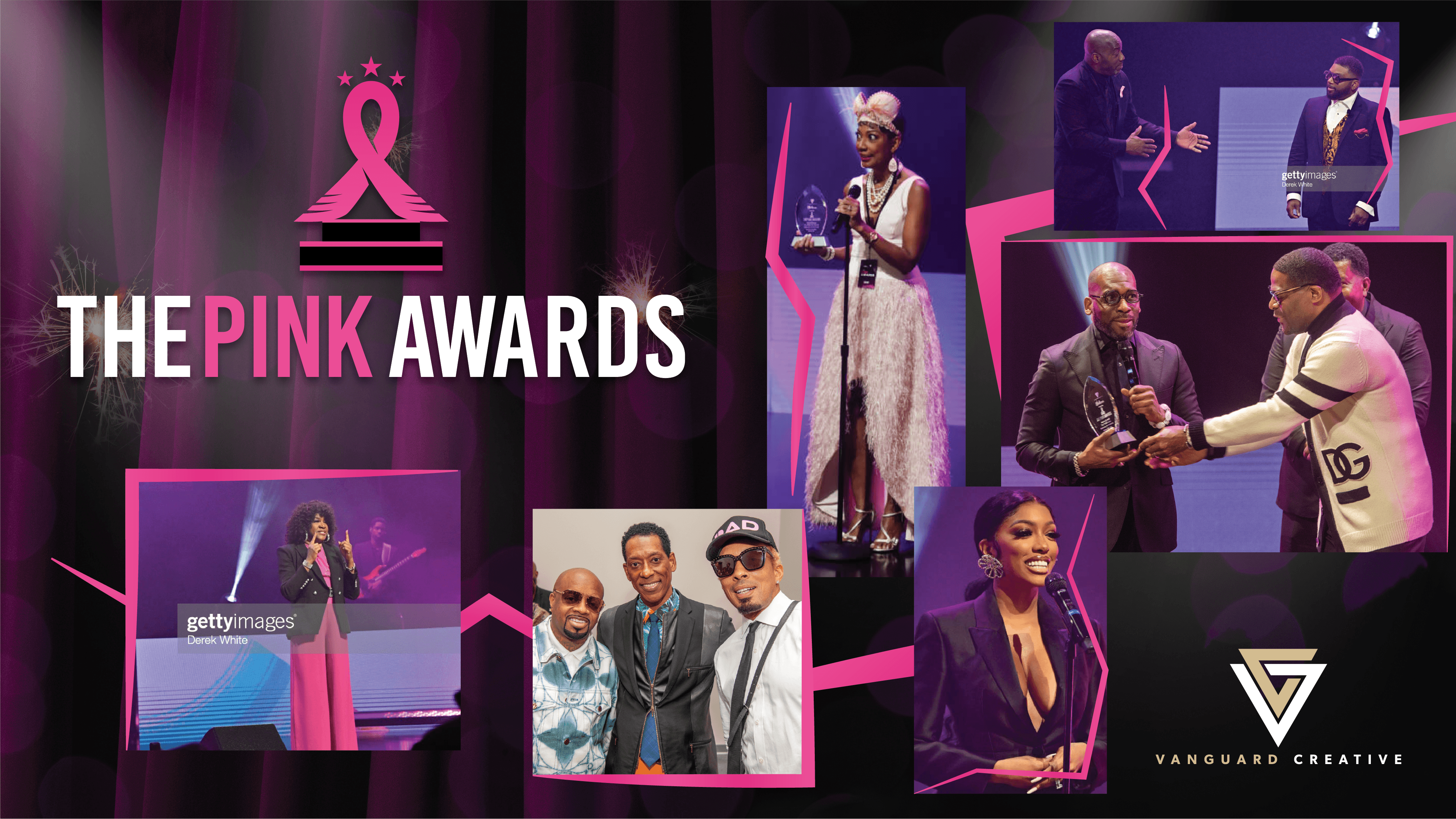
This was the first deck in the series with the main goal of showcasing the mission, the venue, the celebrities involved in the entertainment from the previous year, and finally the awards themselves. By showcasing the glitz and the glam it gave the target audience a glimpse into the event so they can see if the level of production and messaging aligned with their own public view.
Sponsor Deck -
The sponsor deck's main goal was to spread awareness of the upcoming event and to gain initial sponsors and advertisers to provide funding for the event, along with securing a venue. It needed to convey the overall spectacle of the event, from the format, to the audience, and the vision to communicate that any money pledged via sponsorship or advertisement wasn't just a cash grab.
Production Deck -
The production deck was being used to show that this was not just a ceremony, it was an event full of performances, celebrity guests, vendors, and most importantly, the people being awarded for their contributions towards the pink awards mission. Showcasing the previous year's event, it was setting the standards for the production crew for this year's event, along with enticing new vendors.
THE THINKING
To solve the problem of each deck addressing a different audience, and since the copy was provided, I had to rely on image selection and visuals. Here is what I did for each deck to help connect with the correct audiences.
Shop Deck -
As the target audience for the shop deck (celebrities and vendors) were making a decision as to whether or not the Pink Awards were credible enough for themselves to be a part of when looking at this deck, I chose images of celebrity hosts, award recipients, and entertainment for the cover to give them immediate validation. Adding in a stage curtain and stage lights highlighting the Pink Awards logo added to this. When reading about the logline and format I did not want the target audience to have to envision anything, so I included the hosts, singing, celebrities, and award recipients again to really drive home the excitement of the event. Then in the audience and vision slides, the images I chose put the target audience in the shoes of the people attending the event to see it from their eyes. By shifting from the glitz and glam to the people the event was for these two slides gave the target audience a human connection to the mission.

Sponsor Deck -
This deck was more text heavy than the other two. Since the text was provided and it was important that it was fully read, I added in images that were faded in the background so that the information was still fully readable, but also had supporting imagery. On the slides with less information I took advantage of the extra space by adding in as many relevant images as possible, bringing attention to the audience, many of whom were cancer survivors or were fighting cancer themselves. I selected images for the highlights page that showcased all aspects of the award show, from celebrities taking pictures on the pink carpet, to singers, and survivors. These images supported the messaging of gaining sponsors as anyone who viewed this deck got a clear picture of the impact their sponsorship money would create.


Production Deck -
For the production deck I used images that focused more on the energy of the event. People dancing, singing, playing music, smiling, and celebrating life. This choice helped communicate the level of production that went into the past events, and clearly showed the scale and energy of the event as the standard for the new production crew.


OUTCOME AND REFLECTION
The Pink Awards event grew year over year, which I was able to see through the increase in the audience and scale of the event, visible in the event photos. Based on my work, communication, direction, and how I was able to take the provided content and make it match the look, feel, and impact of the event, the client was happy to work with me on multiple projects.
If I were to take on a project like this again in the future there are a few things I would have pushed to have more influence over:
The amount of information was substantial for some of the slides. Keeping the information on each slide to a few key points, while providing access to the full amount of information through a separate medium (email, website post, etc) would increase the effectiveness of the decks. Too much information makes the slides too complex to comprehend at a glance and could lead to less interest from the readers.
Branding consistency was a major pain point for me throughout the process. Each year the branding would shift, which in turn hurts the credibility of the brand. Consistent messaging and visuals help create trust and recognition and by changing each year, even slightly, you can lose any trust or recognition you may have created.
Instead of creating the slide decks as pdfs to be emailed, I would suggest setting them up as webpages to act as pillar pages for the main Pink Awards website, which would help gain more authority visibility online.

